First off, here’s a breakdown of who pays into personal income taxes. Look at those numbers and SMELL the unfairness.

So, the top 10% of income earners pay 69.9% of the income tax while the bottom 50% of Americans pay 2.7%. Now, if we were actually going to make the tax code more “fair,” who would actually be paying more and who would be paying less? Maybe the rich aren’t getting quite as sweet a deal as you’d think if you got your information from Obama speeches and MSNBC.
Now, here’s another chart that defies conventional wisdom.

Over the decades, tax rates have varied quite a bit. They’ve even gone up as high as 90% in some brackets. Yet, the actual amount of revenue coming in doesn’t change very much in relation to GDP. It’s almost as if conservatives are right and people do react to higher tax rates by changing their behavior. Maybe they work less, take more loopholes, lobby Congress to create loopholes, invest differently, move industry offshore, etc., etc…it really doesn’t matter.
The key thing to take away from this is that the amount of revenue the government can bring in via the income tax is, for whatever reason, more inelastic than most people think. That’s yet another reason to put more emphasis on balancing the budget via spending cuts as opposed to trying to fix the problem with tax increases.
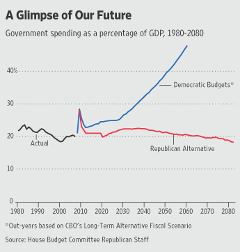
Now, if Hauser’s law is as spot-on as it has been in the past and it’s going to be difficult to raise the government’s revenue level much beyond the 20% of GDP mark, this is one hell of a scary graph.

Notice that we’re up from 2.7% of GDP in 1965 to 9.1% (the halfway mark) in 2012 and then 100% of all of tax revenue in 2052. Some people may take a little comfort from that. After all, 2052 seems like a long time away — and so it is. But, don’t forget — we have a 14 trillion dollar debt we need to pay off and the federal government funds a lot of other things besides those entitlement programs. That money is where defense, intelligence, border security, government salaries, interest payments on the debt, welfare, and even Harry Reid’s precious Cowboy Poetry comes from. At one point do people look at the size of the deficit, size of the debt, and numbers like these and then conclude it’s not safe to lend us money anymore? It could be much sooner than we think unless we start showing the world we’re serious about controlling spiraling entitlement costs.